Browsing Faster with Flock
Safari has always been my browser of choice. It's ease of use and speed has kept me coming back to it even after making Firefox my default browser a few times. But despite the recent update of Safari, I've been turning to Flock for connecting to sites like Flickr.com and YouTube. It seems clear by now that Apple doesn't seem interested in integrating social networking or Web 2.0 technology within its popular applications or the iPhone. Sure, its made some overtures to Flickr, Facebook, and YouTube by integrating these services into the iPhone and iPhoto, but when it comes to Safari, where obvious and direct connections could be made, it hasn't seemed interested in doing anything innovative in this area.
I'm almost resigned to the fact that no one browser can meet the all the needs of different users. So I've turned to Flock simply because it's a better way of navigating social networking sites, especially Flickr.com which I upload to and visit on a daily basis. What developers of Flock understand is that users spend lots of time flipping back and forth between web pages viewing and accessing various types of media, while also writing, posting and sending messages. With Safari, the user interface in terms of web browsing is basically linear. You're pretty much using tabs to drill your way into a website. This works okay if you're just viewing pages, but if you're wanting to make your user experience interactive, Safari's tab browsing method can be time consuming.
Enter Flock's Media Browser
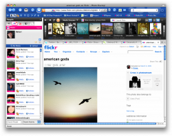
While there are many great features in Flock, its most important and unique feature is its media bar and social contact panel. The media bar displays streams of media, such as photostreams, albums, and videos found on Flickr.com, YouTube, and Facebook. Using the media bar enables users to browse, preview and select media, and have selected pages downloaded into Flock's main window, while at the time keeping a media stream visible. In addition, if you're visiting a member sites like Flickr, you get a list of all your contacts on the site so that you can easily link to their updated pages or media streams.

This type of user face makes web browsing less linear and more interactive. Flock of course includes traditional web browsing features, but it seems to understand and support the direction that popular interactive websites. So when I use Flock, it always makes think about how Apple seems to have fallen behind in some ways when it comes to building Safari and making it serve the needs of more advance computer users. When I use Safari I find that I'm opening closing many more tabs and windows than I do in Flock. Almost every link I click on in Safari means a new tabbed page or window. With Flock, you can view and access two or three places at once without having to open up new windows to do so. Of course Flock works best for social networking sites, but similar interface features could be developed to say better navigate sites like Amazon and Netflix, whereby for instance searches on those sites could be downloaded into Flock's media bar.
Flock's unique user interface may seem complicated at first, but once you spend some time understanding how it works, you will discover that it makes really great use of space without sacrificing the traditional web browser features such as tabs, and favorites and history folders.
Flock is a free download for both Mac and PC.


Comments
It’s very interactive but a little too “non-linear” for me…