DockFun, Your Alternative Dock
Most people I know who use a Macintosh enjoy customizing their machine in some way. Whether this is changing themes using ShapeShifter or adding an application to enhance the OS X experience, they all do it. Although I don’t put my hands up to changing themes, I am a regular application-enhancer user and I love downloading new applications developed by small time companies to make the already easy Mac experience, easier.
Last week I came across an application called FileGazer (read my review here) by Donelleschi Software, which gave you a sort of alternative way to access and preview files and folders throughout your system. It was almost like a Start Menu system but for OS X. This week, from the same company, I’ve tried out yet another application called DockFun.
As you can guess from the name, it’s basically a way of making your Dock fun. Well actually, that’s a lie, it’s not a huge amount of fun, just slightly more efficient than your normal OS X dock.
Categorizing Your Applications
If you’re like me, you’ve got about 40 applications sitting in your dock that you use on a regular basis, and you’ll know how frustrating it can be to have a cluttered screen. Sure, I could remove them all and leave the ones I use the most, but why should I?
So where does DockFun come into things? I can now categorize my applications and have them open up, in their categories, in the dock with simply a nudge or two of a hot key.
Let’s say I wanted to have just media applications appear in the dock, such as QuickTime, RealPlayer, MPlayer and iTunes, for example. I could set up a Media dock group, add the applications I want in there and then set up and press a hot key (for example, alt+ctrl+m), and the dock launches itself with just the media applications I selected and all in fast time. Handy right?

My new “Media” dock that I set up using DockFun
The same will apply to any application. If you wanted to set up a “Creation” dock, you could have Adobe Photoshop, Dreamweaver, Flash and Preview appear, or what about a “Coursework” or “Business” dock? Pages, MS Word, MS Excel, Text Edit. Sound good?
When reading about this and before downloading, I was a bit curious as to what might happen to already open applications once I load a new dock. Thankfully, they stay open and their icons are still present until I decide to close them. So once things are open, they stay open until you say so.
There is another dock feature present in DockFun. When you’ve enabled a custom dock, you’ll see all the applications you’ve selected appear, but you’ll also see currently open applications - from before you changed dock - as well as Finder (which is always there by default). Should you want to go another way about this, for example, keeping your original dock but using a new dock to show only the applications you want, then you’ll need to use the built in tool called Donelleschi’s Dock. Once you click on this, a little window appears (View Donelleschi Dock) which shows only the applications you’ve got listed in that category.
In this mode, it’s also relatively simple to change category by clicking on the square, which appears when you hover your cursor over the window, and then selecting the category. I realize all of this may seem a little confusing, especially if you’ve not used the program before, but I assure you it’s all straight forward.
For your information, the names these docks have (Media, Creation, Coursework etc) are ones I’ve created and have done so in such a manner that it makes more sense to you. You can call the docks anything you like, but I’d advise you name them something memorable.
Loading Docks
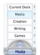
There are a few ways to change docks whilst in DockFun. The easiest way would be to simply set up a hot-key for each dock, as I mentioned above. A couple of other ways include using the DockFun floating window (see image below) that stays visible over all other applications, or you can right click (ctrl+click) on the dock icon and select the categories from there. The floating dock, for me, was rather frustrating as it does, with reason, sit above all other applications. After using it for a while, I decided to stick with the hot-key function because it got in my way.

Setting Up DockFun
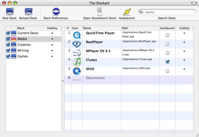
I’m quite impressed by DockFun’s customization features within the main window (refer to image below). Once you’ve created a dock, you can customize it beyond that of a normal dock running in OS X Tiger.
First off, you can change the icon for each dock. The DockFun application icon can be changed to a variety of preset icons so, in the event you’ve got more applications running than you desire and you’ve forgotten which dock is loaded, you can use an icon to assist.


Comments