The New Yahoo! Messenger
It seems to me that companies such as MSN and Yahoo never really gave a damn about us Mac owners, offering us second-rate software that would only be acceptable back in the days of OS 8 and Windows ME. Yahoo! Messenger 2.5 only seemed to be a more popular choice for some time because of the web-cam function that it offers, something which we’re still all waiting for MSN to introduce to its service.
If any of you use Yahoo! Messenger 2.5, you’ll know how ugly and awkward it really is. The interface is nasty, the features are rather lacking and useless and the overall feel of the application is clunky and unsteady—I’ve often found it crashing when conferencing with people using webcam.
Many of you will have heard Yahoo! finally introducing the long needed update to its aging messenger program and, although still only in Beta, it is available to the public.
The Look
First and foremost, the facelift. Yahoo! finally seem to have caught up with OS X and introduced a brushed metal-style effect which now fits in with the look of Tiger. The edges of the windows no longer look jaded and badly sketched like it’s predecessor and even sticks with the minimalist look that Mac owners should now be used to. There are no more annoying window buttons at the bottom of the application, as seen on the current version of Yahoo! Messenger. Instead, they’ve moved the four buttons at the top (New Message, Add Contact, Webcam, Mail) to the bottom, also making it much clearer as to what each button is for without the need of words. On first opening Yahoo! Messenger 3.0, you’ll notice how much it looks like iChat with the sky blue/light blue alternating contact list style.
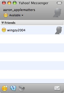
New Yahoo! Messenger 3.0 Buddy List
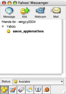
The old Yahoo! Messenger 2.5 Buddy List
Chatting
You’ll be pleased to hear that by default, that incredibly annoying ‘ring’ when a new message has arrived has finally been removed, and hopefully destroyed with some sort of nuclear device. Instead, we’re presented with some rather soothing and not-at-all-intrusive ambient sounds when we both send and receive a message.
Once again the look of the chat area is much the same as the main window in that it sticks to OS X’s metal look. Each conversational line is broken up into boxes to make reading much easier on the eyes, it also helps that they’ve used a variation of colors too. User icons are rather in your face but are a nice addition when compared to the current Yahoo! Messenger 2.5. Again, minimalist is the way to go and the text formatting buttons have finally been removed - instead, these are customizable in the preferences, which I’ll get onto in a moment.
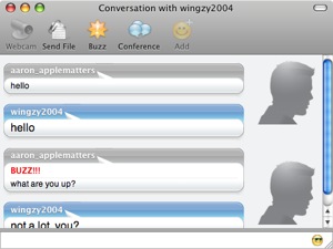
New Yahoo! Messenger 3.0 Chat Window
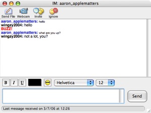
Old Yahoo! Messenger 2.5 Chat Window
A couple of other things that have changed is in the introduction of two new buttons. Buzz and Add Contact are now both present at the top of the chat window, next to Webcam, Send File and Conference (which has replaced ‘Invite’). Again, all these buttons are much cleaner and easier to understand, something which is a huge relief, especially to those with poor eye-sight.
Sending a file, starting a webcam conversation and adding someone are now much more straight forward. In the current version of Yahoo! Messenger 2.5, you hit these buttons hoping to see the actions take place, but instead, you’re asking if the user you want to send a file to is, in fact, the user you’re talking to. It seemed a little silly to ask the user if what they’re doing is correct, almost like we’re too stupid to work out what the buttons are for. The new version of Yahoo! Messenger, however, bypasses these feature and takes you straight to what you want to do. So, when I try and send a file, rather than asking me which user to send it to, it assumes I meant the user I’m currently chatting to and asks me to locate a file to send. Perfect!
Preferences
Remember Yahoo! Messenger 2.5’s incredibly confusing and OTT preferences, found in both Windows and Mac? Well thankfully Yahoo! have decided to package this up with the ‘new-message-ring’ noises and thrown them both straight in the bin. There is a god after all.
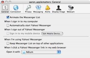
New Yahoo! Messenger 3.0 Preference Pane
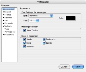
Old Yahoo! Messenger 2.5 Preference Pane
A lot of the options from before are still there but are now under different tabs, making it much easier to see what we’re doing and to know where a certain option lies. Apart from the aesthetics, not a lot else has changed except from the Display Image tab which is new to this version of Yahoo! Messenger. Users can either browse for an image on their computer and use that as an Avatar, take a picture from within the Preferences themselves via webcam, or create an Avatar via Yahoo!’s website. For the sake of all that’s fun and glorious on this U.S Independence Day week, I’ve decided to create my own Avatar, mainly for a bit of fun on my part, but also to show you what’s on offer. Check it out. Alright, not quite like me, but close enough.
Summary
It’s refreshing to see Yahoo! Messenger finally being introduced to the 21st century, something which I know many had been waiting for, for some time. The overall service hasn’t changed much, the main reason I haven’t gone into it - so if you’ve used Yahoo! Messaging service before, you’ll already know what to expect. The software itself is less frustrating to use and much faster than the current Yahoo Messenger and, although no major new features have been introduced, the whole look and feel is much more appetizing.
One thing I’ve struggled to mention, is that according the home page of Yahoo! Messenger, a future release will see compatibility with those using Windows Live Messenger, software Mac owners will probably never see. What does this mean? Well, instead of using Microsoft Messenger for Mac, we can use Yahoo! Messenger to do both MSN and Yahoo chat protocols. One thing remains to be seen though, will we be able to webcam chat with those using Windows Live Messenger?
Of course, I should reiterate that Yahoo! Messenger 3.0 is currently just a Public Beta, and this means that although the software is reasonably safe to use, it’s not on final release yet, so there will be some bugs popping up somewhere. However, in the few days I’ve been using it, it’s not crashed or failed on me once and has been nothing but reliable when compared to the old Yahoo! Messenger 2.5.
See for yourself though and give it a go. You can download from http://messenger.yahoo.com/ and it’s only 6.2 MB’s.


Comments
Very good article.
Please keep reviewing programs and hardware for us Mac users. I love to read each and every one and have used software that you recommend in your reviews. ImageWell for example. An excellent program for us Mac users.
Keep the reviews of software and hardware coming. Keep up the good work.
I like the way you present screen shots of both old & new revs. It is refreshing and it saves us Mac faithfuls from installs/uninstalls just to have that hands-on walk-throughs.
What did you use to take screen/window shots like that? Is it a widget? Kindly share.
As for the new Yahoo! IM, it’s good to see that they’ve finally caught up with iChat’s UI paradigm (bubble talks and avatar). I’m still an iChat proponent but if Y! can show Apple a new direction then the competition is worth it.
Mac_Man, thanks for the feedback, I can’t tell you how much we appreciate it! Good or bad we want to hear it, although good feedback always makes our day!
like it’s predecessor—> like its predecessor
Thanks for your feedback Mac Mac, I appreciate it, as do we all at Apple Matters, as Hadley has pointed out.
Robotech Infidel, I’m unsure on past operating systems, but in OS X 10.4 Tiger, simply hitting Apple+Shift+4 starts the screen capture process. You’ll then see a cursor appear where you can drag over a ‘blanket’ onto certain areas of the desktop to take a snapshot of. To get a picture of a particular application or window though, simply hit Apple+Shift+4 and then when the cursor appears, hit Space bar once. You’ll then see a camera appear where you can take a screen shot of a particular window. Hope that helps.
What did you use to take screen/window shots like that? Is it a widget? -Me
OK the method simply hit Apple+Shift+4 -Aaron works but not enough “oomph” for me. I think Bbx has one like this on his wish list (http://www.applematters.com/index.php/section/comments/12-things-i-hope-to-see-in-os-x-105-leopard/).
I did find one widget called Screenshot Plus v2.2 and can do much more than taking snapshots of a particular area of a screen. It can do full-screen, any open windows, part of screen, and in many standard graphic formats.
I know, I’m off-topic but I just want to let our newer Mac readers to know.
Another fantastic screen capture tool is Snapz Pro. Unfortunately its not universal yet so it is a little slow/funky on my Macbook Pro but I used it for all the screen caps in iPod and iTunes Hacks.
Thanks for the tip, Hadley!
So, besides comparing Y! IM v3 (beta) side-by-side with the older Y! IM v2.5 client, how is this v3.0 compare with the latest iChat AV? Does it break new ground as far as features or functionality? I can see from your screen shots that the UI is Aqua “native” and feels at home with OSX. It would be great to follow this article with similar theme, perhaps a multi-part edition (a la Chris Howard in his PC market share tri-parts).
I’m not the kind to trust “beta” editions lightly. I would have to have a guinea pig like a VM to do that. If it kills my OS for some reason. Kill the VM and re-create. No problem.
And how does Y! v3 for Mac compare with AIM and Y! IM for XP? I’m sure our readers would be interested in that follow-on article.
Robotech,
Nice idea. What I may do is wait until the final release of Yahoo! Messenger 3.0 in a few weeks/months (however long it will take). I don’t think it’s fair to compare too much at the minute considering the features on Yahoo! Messenger 3.0 are still lacking (and more are promised to be implemented). Thanks for the idea.
I had reviewed YIM 3 beta on my blog a few days back. I liked the re-vamp conversation window style and the fact that YIM supports growl notifications.
However, it doesn’t include an option to log conversations which should have been there(such a basic feature!). Also, they need to get rid of the YIM5 emoticons.
http://techlogy.net/blog/2006-06/yahoo-messenger-3-beta-review